I loved Photon. Proton added a lot of nice touches, but I never understood why would you want to turn the tabs into buttons. Tabs is a great metaphor from the real world, and they take less space. I don't see a single advantage of styling them as buttons. The whole point is that they're visually connected to the currently visible page.
Thankfully however I don't care too much because I can still completely hide the tab-bar with my userChrome.css, and use "Tab Center Reborn" to have my tabs on the side instead.
Seconding the tab idea. I need to know in which tab I am. Sometimes I have the five tabs of the same page (hello hn), look up, and I don't know which tab I am. I end up closing the tab with Ctrl+W when I'm done and learn where I was.
Thanks for the extension suggestion I may give it a try.
One advantage I could see is a vertical tab bar mode that’s more visually consistent with the standard horizontal tab bar. Could even animate seamlessly between those modes.
Unpopular opinion: I personally like the 'floating tab' look more. It's sleek and consistent and doesn't bother me at all. Though I think it should be a toggleable setting not a default.
> why would you want to turn the tabs into buttons
I think I read somewhere that the reason was that user studies showed that people did not understand that the tabs could be dragged around, moved to other windows, and generally were "detachable". Floating buttons should make that more obvious.
I'd be interested in research on whether they achieved that goal.
I can't off-hand remember any application where I was able to drag around buttons or, really, interact with them in any way other than pushing the button. That said, I don't think the widgets look particularly button-like (e.g. only the selected tab widget as any depth, the other widgets are flat).
Yeah good point, I don't know any either; guess it's more the "detachedness" than the "buttonness" that's supposed to hint at that. As I said, I'd be interested in seeing data on whether or not they were successful.
The problem with user studies is that privacy-conscious power users (which are the majority of Firefox user base) don't like to participate in those studies, which make them really skewed.
I've always found the UI after IE6 / FF2 to look "off", and that's likely because they started using non-native controls, drawing their own instead of relying on the platform UI.
Firefox’s Redesigned Preferences Feel More like the Web
That expresses exactly what's wrong --- the native UI controls are predictable and accessible and styled with the rest of the OS, and as the cascade of dialogs above it (I'm not sure how that's even possible --- getting to "Offline Data" From "Exceptions - Saved Passwords"?) shows, you can actually see that you're controlling the browser and not merely a page inside it (related article: https://news.ycombinator.com/item?id=30697329).
Another important change is the introduction of a skeleton screen to make the start feel fast
I've never heard that term before, but whenever I see things like that, I'm reminded of fancy progress bars and such --- the real problem is that you need one in the first place, and instead of fixing the underlying problem of why it's taking so long, you try to hide it...
> Firefox’s Redesigned Preferences Feel More like the Web
This is such a weird thing to me. Did anyone ever want this? Were users asking for this? Did user studies show that this was somehow desirable or preferable? Did they do a study of Chrome users and find that they were more likely to stick with Firefox if they made this change? Does it significantly reduce code maintenance burden somehow?
It seems like the kind of thing where users only "want" it because it's familiar, and it's only familiar because it's already been forced on them everywhere. Basically it's circular reasoning. It's like the meme of hiding a button and then claiming that users never use that feature, so you can justify removing it.
The problem with modern, native-looking UI surfaces is that they are hard to design and maintain on cross-platform applications.
How do you design and implement an interface that feels native across platforms?
First there is the easy approach: The common denominator elements. Essentially what you get when creating a Java Application. The UI will probably look kind of native, but also outdated. Think Windows 89-Style Settings. You're also limited in how you can present options because you have so few form elements to play with.
The other approach to native is to use modern UI elements. For one thing these are not easy to get. While on macOS Cocoa bindings are at least available, on Windows it is pretty much impossible to get anything but the Windows-89 style form elements. Even if all the bindings were available, which also has to take various Linux Desktop Environments into account, then you had to design for and maintain multiple versions of the same settings menu.
So I hope this explains why non-native controls are a sensible approach. You create your own design system that is (mostly) consistent across platforms. Designers only have to design one surface, they can create new patterns if necessary and engineers only have to maintain one implementation. Of course they have to be accessible and they are. I say "mostly consistent" by the way, because Firefox still respects some UI conventions from operating systems. For example it uses system fonts, system font-scales, and changes naming conventions and button orders appropriately.
This reduces work but of course it still is work to update and maintain that surface. about:preferences in Firefox has quite become quite messy over the years and is neither loved by designers nor engineers, but it's time and resource intensive to update it.
Well, your argument is based on an assumption that chasing latest trends of micro web apps is somehow inherently THE path to strive for. Redesigning around latest trends with web frameworks getting obsolete quicker than you can realistically complete a large project is really inefficient in itself.
Is it really more efficient to maintain a design framework chasing latest web trends instead of having separate native interfaces?
I didn't say anything about web frameworks or chasing latest trends.
Developing a cross-platform app that uses native interface elements is extremely time intensive and sometimes laughably complicated[1].
With design system I meant that designers create a spec how the UI should look like and behave (eg. the primary button in Firefox) and then engineers implement that in a reusable way. Designers can then use their own specs to create new surfaces and engineers can use their reusable components to make the specs real.
This is a lot more efficient than either maintaining three code paths for the whole UI or building and maintaining a complex abstraction framework for native surfaces. That's what XUL was.
That's the reason why there are barely any UI-heavy cross-platform apps and a lot of web-apps.
> With design system I meant that designers create a spec how the UI should look like and behave
This is the core of misunderstanding. Once you define your goal as "the app should look the same across platforms", you inevitably set yourself up for these shenanigans. In order to keep consistent look and feel across platforms you either implement (and maintain!) a complex abstraction layer over platforms or reduce the design to "common denominator elements". Web (both remote and electron) seems to be an attractive solution, because it offers the more pleasing abstraction option and a lot of heavy lifting is handled by browser and framework developers.
You base your argument on consistent look being the ultimate goal and desktops being somewhat moving targets. Well, the web is a target moving even faster and I see no reason to regard consistent look as the ultimate goal. It could be easily argued that platform native look is an even better option.
Essentially, it boils down to two fuzzy metrics: fraction of users regularly moving between platforms and preferring consistent look (a windows-y app on mac will look off, webby app will look off on both platforms) and long-term cost of maintaining the consistent look versus maintaining separate fully native interfaces. Somehow I tend to believe that in the long run native interfaces are the better option.
Web only makes it easier to build cross platform MVP and forces one to release features in tandem across platforms.
hard disagree here. Let us look at Windows and macOS for a second here, and exclude Linux, because Linux (rather, Linux + your favorite DE) is realistically the issue (due to KDE, GNOME, and a gazillion other types/styles). If you design around a given language for the most recent versions of a native OS, you'll never have issues. Both macOS and Windows include common libraries that map to their respective styles. Microsoft, for example: https://docs.microsoft.com/en-us/windows/apps/design/ (link on bottom if you want to drill down to code).
"What about users that want to customize things?"
Give them an alternate path. The browser loads slightly slower (the same as now), and they still get their ability to customize. The rest of us can use the default, faster path.
> Let us look at Windows and macOS for a second here, and exclude Linux, because Linux (rather, Linux + your favorite DE) is realistically the issue [...] If you design around a given language for the most recent versions of a native OS, you'll never have issues. Both macOS and Windows include common libraries that map to their respective styles.
That is a bold statement and largely not true.
Most DAWs are only developed and maintained for Windows and Mac. Almost all of them are using their own set of widgets/gfx because they want control on their style and they want it to be the very same on both Windows and Mac. Their software is very specific and want their tool to look and feel like hardware, not a regular software.
It is mostly about control. Linux doesn't have anything to do with that and any software maker can decide to only support GTK or QT, libwine or whatever toolkit it wants to use and stick with it. Linux users are used to run QT apps on Gnome or GTK apps on KDE, they are not the one that would complain and given the market share, the software companies are happy to give the middle fingers if they do so anyway.
Product designers should definitely favor local OS norms in most cases. Using one design for all OSs might be organizationally easier in many ways, inter-OS visual consistency offers little benefit to users and doesn't leverage their familiarity with similar idioms in their environments.
> Another important change is the introduction of a skeleton screen to make the start feel fast
Yeah. Sometimes you do have to make users wait— e.g. parsing a huge cache to put in a dialog or making shaky network calls— and most designers mental model for addressing that frustration is the slow elevator problem†. Skeletons seemed like a good way to address it. We don't parse screens instantly: we first interpret structure/visual hierarchy so we know where to scan for titles, ordinals, controls, or whatever else we need. Skeletons theoretically let us do that while content loads. More recent research doesn't corroborate claims of silver-bullet efficacy:
† The related anecdote goes something like this: Tenants of an NYC office tower complained of slow elevator service during peak use. The property manager consulted with experts to evaluate the algorithmic efficiency and mechanical components, but it resulted in little improvement. The property manager then turned the exterior elevator doors int mirrors. Most riders were sufficiently emotionally engaged by a life-sized version of themselves long enough to make the wait seem much shorter.
FWIW, I personally really like it when a product is consistent across different devices. Most of learning to use a new product is learning a million details about that product and once I learn them I don't want to have to find they look super different or are in a radically different place just because I happen to be using a different computer for a day. The operating system doesn't really matter: it is a commodity at this point; but I want everything from Word to Facebook to look and function as much the same as possible on every single computer / device... which, BTW, also means I want it to largely look and work the same across different versions of the operating system, as if I am sitting down today at an old computer in a library I don't want Word to be some seemingly unrelated experience to when I use it on my newer computer.
I thereby will claim that cross-platform UI toolkits (which includes "the web") actually affords me--as a user--tremendous value, and I am always pretty happy when I see a product start to figure out their house brand. I do appreciate the other side of this, and I even have sometimes argued it myself to engineering teams I work with as--if nothing else--using the local style is certainly better than being bad at style, and I frankly would rather avoid having to work with a designer. But is it really so shocking to appreciate mine? I always feel like people jus let casually dismiss the idea that users might actually prefer software to look the same everywhere, and yet I feel like it is only particularly snobby tech people (which does include me: I hate poorly done UI) that seem to want the fully unified toolkit, and I think the success of bespoke UI in games really demonstrates this.
I’ve done more dev work than design, but I’m educated as a designer and do both professionally. A big part of good design practice is studying what your users do and making decisions based in that. Assuming your use case is representative enough to reason about your users’ needs and that interface design is unnecessary with a solid enough UI kit is exactly why designers need to be involved. It’s also why almost all FOSS UIs are garbage.
Most users don’t use the same app on many devices and operating systems. That you consider the OS a constantly changing fungible component in your daily tool chain is incredibly unusual. Outside of some dev and IT tools, optimizing for that use case just doesn’t make sense and even most IDEs don’t try. Most device UI kits are more carefully designed to suit their users interaction needs than any app could hope to achieve, especially considering accessibility.
People use dozens of applications but only two or three devices, often from the same OS family. Just by the numbers, consistency across applications will better suit that pattern than consistency across platforms.
Except a browser should load things in the following order:
1) Create Window
2) Create UI (based on native controls for OS)
3) Load drop downs, top level down.
4) If you design your application this way, you won't have to build a skeleton. Mozilla is not using native UI/UX components to build their UI, so they have to go through several extra steps. I'm sure they do this in the name of customizability, but that, IMO, should be optional.
> I've always found the UI after IE6 / FF2 to look "off", and that's likely because they started using non-native controls, drawing their own instead of relying on the platform UI
Wow, I think you've identified the probable cause of something I've felt was "wrong" about Firefox for a long time but couldn't pin down. Firefox just "feels" bad on a Mac even in comparison to Chrome, not to mention Safari.
The new web-based pop-ups can take a long while to render if a heavy page is being loaded. So if I try to quit Firefox, the "are you sure you want to quit" popup renders empty until the current page is done.
Sure, this happens only on high resource usage, but the previous implementation di not suffer from this.
I think it's just the trend, ms also introduce the fullscreen file menu in office 2010/2013. Their menu also changed to more flat and fullscreen ui instead of popup based. The firefox simply matches the trend (and it is actually a little late to the party)
What an absolute abomination that was. An insane waste of space and a violently assaulting visual distraction. Especially when you're trying to open a document that the current one is referring to, hiding what you're trying to see with useless space.
For me Firefox’s UI design started going off the rails with Australis and Photon, where its UI began to be a major component of Firefox as a brand. I much preferred v1-v4 where Firefox felt more focused on being a tool that fit well into your desktop instead of trying to stand out.
I’m sometimes tempted to try to start a Firefox fork that returns its UI to a “smaller part of a larger desktop” look and feel, but then I remember how impossible it would be to maintain that over time. Wish Gecko was still embeddable so one could just write a new UI and not have to keep patches maintained.
Very well said. People often claim that everyone complains about every Firefox UI change, but this is a perfectly consistent thing to do if you think Firefox has been getting slowly worse since v3.5 or so.
The one thing I will say in its favor is that Firefox still maintains a decent amount of customizability, at least for the seriously dedicated. I still have a separate search bar, a menu bar, and have removed the "hamburger" menu button entirely. For me, the UI has changed very little over the years, but the pile of hacks in my usercss file has grown over time...
As people engage with many more devices on a day to day basis, applications have moved away from "matching the rest of the OS" and towards "consistency of the look an feel across all platforms".
It's still "consistent", just on a different dimension (app-wise instead of OS-wise).
I know HN favors the former, but I don't mind the latter too much. Especially when products are able to strike a nice balance like Outlook on Windows & Mac.
Even v4 was too much for me. I liked the UI pre-v4, and for the longest time after v4 released I would use the FF2 theme (back when themes meant more than just putting an image on your chrome - but that's a whole post by itself) and various extensions (Classic Theme Restorer, Status-4-Evar, and a few self-made Stylish userstyles) to preserve the look of pre-v4 as much as possible. It was comfortable for me.
Or finished Servo enough to embed that. Either would be awesome, then it could be "easy" to make a new browser. Used to be able to do this on Windows (c2000) and reuse the IE renderer all over.
Removing icons from the menus has been one of the most puzzling decisions they made. In the year or so since its removal, using their menus has been a real struggle, and I can see there's even an entry on Mozilla Connect Ideas for it: https://connect.mozilla.org/t5/ideas/bring-back-menu-icons/i...
As for the 'curvy' tabs, I can't say I was a fan of it, even in Chrome, it feels like a waste of space and draws attention to it. The straight tabs, even the 'button' tab is a lot better in being out of the way.
Icons in menus are good visual anchors which leads to better usability, but only if they are used sparingly. An icon for every menu item ends up being worse.
The key here is that the icons next to the entries robustly tied the menu entry to the icon in the toolbar: "this menu item does what the button with this icon does".
Getting rid of the icons in this case means you don't get a hint that this menu entry is an alias for that button (or vice versa).
Let's say you want to print something, all you need to do is pop open the menu and can quickly scan for the printer icon which is a recognizable shape.
Without the icon, you have to consciously read the lines in the menu to make sure you are clicking on the right one.
You still read the text with the printer icon, but it's a faster index-match when the icon is present.
I understand that costs some milliseconds and distraction and might be inferior GUI in many situations, but calling it a "struggle" seems like a large exaggeration, especially for the HN crowd which probably just presses CTRL+P.
Notice: cjk languages often need 3+ key stroke to type a single character.(and sometimes need two more to select the right character). Or you need to remember random letter unrelated to its display name in order to pop it up with one key stroke. It's NOT really a proper alternative. I really hate about the Western centered design firefox introduced in the latest several iterations. It really makes using firefox so painful that I decide to change it on my own using userChrome.css.
Now add to it people that use machines with different language settings. On my own devices English, but clients provide clients in German, Italian or Dutch. With icons and limited language skills it did not matter. But finding the item without exactly knowing what term is used is really frustrating.
The only UX/UI request I have for Firefox: Stop changing it. Don't add any more useless tweaks or adware or bundled services.
Its UX "history" made it plummet from the top browser at one point to a forgotten has-been. These tweaks were not successes or celebrations, they were the death by a thousand cuts.
Firefox would still have declined, that's kind of unavoidable with Google owning Android, but Mozilla wasn't helping here. Turning Firfox into a lame Chrome-clone by removing everything that made it unique in the first place just ensured that there was no more need to bother with Firefox. Loading the browser up with all kind of telemetry, cloud nonsense and ads also removed any desire to ever bother with it again.
I still think there is plenty of room for a privacy respecting browser in the market, but Mozilla hasn't even been trying to fill that niche in years and still claiming to do so just makes them look like untrustworthy liar.
We hackers like to complain about stuff that bother us, but the truth is they don't bother anyone else but us. Firefox didn't lose marketshare to Chrome because it had telemetry. Users don't care about it, and if they did, they'd know Chrome is doing it much worse. Same for "cloud nonsense and ads" - you really think they disliked it so much, so they went to Chrome were they are forcefully logged-in, have every action linked to their Google account and have inferior adblockers? C'mon.
It's kinda like saying "I'm moving to North Korea because freedom of speech in the US sucks!"
People that don't care are already well served by Chrome, they are never going to switch, so there is little point in catering to them. People that do care however aren't well served by Firefox, that's an issue.
Every thread about Firefox is filled with complains, be it removal of essential feature, shifting around the UI for no reason or addition of stuff nobody asks for. Not every user might care about every of those issues, but do you think that amount of negative feedback is good for attracting new users or keeping existing ones? I don't.
Also the level Firefox has sunken too is mislabeling the Screenshot cloud upload button "Save". That's plain old malware dark pattern strategy to steal your data. They took almost a year to fix that and it's downright puzzling how that ever made it anywhere near a release in the first place.
Chrome might be crap, but I am not going anywhere near Firefox anytime soon either. They have shown time and time again that they really aren't on my side, yet love to claim so. The sooner we get rid of Firefox, the sooner there is a chance a real alternative might arise.
So what are you using now? Is Chrome on your side?
IMHO, the _moment_ we get rid of Firefox, the _moment_ we lost the free web. Building a web browser is just too damn hard, and never again would free software stand a chance. All will be Chrome-based, and Google will decide what "standards" to adhere to while it sits in a committee with itself.
> Building a web browser is just too damn hard, and never again would free software stand a chance.
That's what people said when I started to write an open-source DAW 22 years ago. "DAWs are just too damn hard, there'll never be an open source DAW".
Except that now there are several open source DAWs, and several proprietary ones, all created since that time.
I am very, very skeptical of claims like this. There is a reason why creating a new browser that lots of people will use is a challenge, but it's not because it's "too hard".
Thanks for Ardour! I've used it many times. I'm not a DAW expert, but unfortunately I don't think that's really similar though... DAWs are complicated, and hats off for building one, but they're nothing like browsers in how much they're tracking a moving target, and how little tolerance users have for something that is incomplete. I have a musician friend that still uses Cubase 6 and it works just fine. Ever tried using a browser from 2011? Do you even dare to?
Browsers need to follow ever changing standards, do all that in a super performant way (remember the days people said they're leaving Firefox because Chrome "feels snappier"? Good luck beating that), keep it secure even though it's running remote code, and until they get it ALL 100% working, no one is really going to make it their daily driver. I already hear people saying that they're not using Firefox because some websites don't render well.
If it isn't "too hard", why do you think that over the last decade essentially no one managed to do it, while we do have several open source DAWs?
> Browsers need to follow ever changing standards, do all that in a super performant way
You don't have to beat Chrome at it's own game. I think the best course of action would be a drastic course change and building a browser that focuses heavily on the creation and publish of content, not just on the consumption. Focus on the Web as document storage instead of as App runtime. That's an area that is still in serious need of work and isn't really covered with Chrome. Also somebody really needs to reinvent bookmarks, they haven't fundamentally changed in 25 years and are in dire need of an upgrade.
Brave (IPFS and Crypto integration) and Project Gemini (focus on text content) are going a little into that direction, but there is still a lot more that could be done.
> Firefox because Chrome "feels snappier"?
It was less because "feels snappier" and more because "complete browser freezes when using multiple tabs". It has gotten better since then, but when Chrome started Firefox was in dire need of some rework.
Sounds like you're not even aiming to create a web browser... All good wishes, but count me out and I sure hope Firefox doesn't take that route.
Don't get me wrong, I appreciate the hacker mentality (go Gemini!), but I thought we were discussing the need for an open web. Sure we can even add NNTP support to Firefox, but that ain't gonna get my grandma switching over.
> I thought we were discussing the need for an open web.
What exactly is "open" about just being a Chrome-clone? If you want to keep the Web open, you really have to work on the "how-to-get-content-on-the-web" side of things, just another browser for pure consumption really doesn't add all that much. Stuff like containerizing Facebook isn't really doing anything worthwhile, giving people something to get away from Facebook would. And forcing HTTPS on everybody really didn't help either, that just killed what remained of the old Web.
It's not like Firefox didn't try, at one point they added Firefox Hello and that looked promising and than it got removed again. And at one point they had RSS support, but instead of improving and building up on that, that got removed again. And instead of improving the Firefox bookmarks, Tab Groups or the Save button they gave us Pocket, which is no different than any other cloud service.
> but that ain't gonna get my grandma switching over.
You don't improve the Web by giving grandma a Chrome-clone, she'll just be Facebook'ing around all the same as she did in Chrome. And when grandma is paying your bills by visiting Google Search, why even bother, cut out the middleman and just use Chrome. It makes no difference.
Now I don't necessarily want NNTP support in Firefox, as at that point we'll just be full circle and back at where Mozilla started 20 years ago, but I want something that allows communication and publishing of content without having to rely on Facebook and friends.
It's those Web 3 enthusiasts that tried to convince us that we need new ways to put things on the internet. There's no problem with doing it today. You can `python3 -m http.server` and you're on the internet. There's no technical challenge waiting to be solved there.
Most people are consumers of data. That's why browsers are called Browsers and not Authors. Grandma isn't building a website for herself not because it's hard, but because she doesn't care. The risk with with Google being the only browser is that they define how we browse. They can decide that next year HTML is gone and Flutter is in. They can decide FLOC is mandatory to view a website. They can decide to only show AMP content. Then, my friend, then it's gets harder to put your own content on the internet. And this is why Firefox is important.
> There's no technical challenge waiting to be solved there.
NAT is still a major issue when you try to self host anything. And most of the stuff you can hobble together in a shell one liner just ends up being broken or limited in one way or another, e.g. that `python3 -m http.server` fails with seeking in video files, just gives "Broke pipe" error. Also provides no way to encrypt or authenticate. And without any way to easily mirror the content it will be unreliable and slow anyway.
Trying to do almost any common task is a nightmare when you want to do it cloud-free. An open web run by users themselves is still an unsolved problem. There some projects working on it (libp2p, IPFS, etc.), but none of that is to the point where it works properly and often missing important features.
> They can decide that next year HTML is gone and Flutter is out.
That already happened years ago. Tons of popular Internet apps only exist as mobile apps with little or no Web interface. Worse yet, most of those apps are driven by user created content. Which is exactly why making publishing a first class citizen on the Web is so important, without that people are just leaving the Web and going to places that allow them to publish and those places will be controlled by your favorite mega-corp.
These are fair points, but they are missing the things that have changed in the DAWscape.
In 1999, and maybe even 2011, a DAW that couldn't do elastic time was still considered to be a major player. In 2011, a DAW that couldn't do clip launching was still OK. In 2011, the idea of cross-routable modulation (like Bitwig now does) was a wild and crazy idea (mostly). In 2011, the idea of a modular environment within the DAW was floating around (Logic had done it for a while) but was hardly mainstream. These things are now either already or becoming more or less mandatory to be considered a major DAW.
Then there is the matter of control surfaces, which keep evolving. In 2011, the idea of a controller that was essentially a programmable grid of illuminated pads was mostly the domain of experimental performance (Monome). And every month or two, a new controller appears that claims to support Mackie Control Protocol, but has in fact bastardized it in some small but significant way. There's also the touch-based controllers, frequently using OSC, and their constantly changing suggestion of what should be possible.
And then there's plugin APIs, which also keep evolving, and we are under enormous expectation to ensure that every single one of many thousands of little code blobs written using one of a half-dozen plugin APIs and by developers with a range of experience that goes from nothing to world expert should all just work.
Over the years, we've also seen constant changes on Windows in terms of the OS-level audio APIs, each change bringing with it new possibilities and new problems. There's no POSIX for this. And, of course, a slow but steady evolution in audio interface hardware, which doesn't often impinge on the DAW itself, but sometimes does.
As for performant, browsers don't even have RT-style constraints, and there's plenty of observations about "snappiness" in this domain too. It's just a much smaller niche, and developer culture (as testified to by posts here on HN) is now very dominated by web-centric thinking and experience. As a result those sorts of things aren't really part of the culture in the way that "wow, Chrome is so fast" etc. has become. Look at the praise Reaper receives because of its (apparent) ability to handle more plugins with less CPU cycles.
As to why new browsers are rare ... I think it's because (1) browsers are not really fun at most levels, and (2) adoption is hard when there's a default on just about every platform. The fun part is important though. Many developers enjoy "messing around with audio" and it provides a kind of gratification that is rare (video stuff would be similar). It's not that cooking up a standards compliant and crazy fast and beautiful CSS implementation isn't without its joys, but there's so little point doing that as a standalone project. Contrast that with the steady drip, drip, drip of developers who want to try their hand at a synth, or an audio file editor, or FX processor and eventually think "oooh, how about a DAW". There's not really any evolutionary pathway for browser development: you're either writing a whole browser, or you're not. Audio gives you a way in, and then the sky's the limit.
The current state is only a bit better. It's basically Google developing features that users and developers mostly want, and Mozzila and Apple shooting them down without really offering an alternative for those use cases.
It's almost the same as old school Linux, where commercial software said "Hey I added this one click button for the main use case" and FOSS said "You don't need that, just have a bash one liner instead".
Chromium is openish. Other developers could fork it if they wanted to.
Firefox isn't doing anything about the fact that self hosting is way too much hassle for anyone but a few hobbyists. They're not really doing much in the IoT space.
They don't seem to be addressing the fact that the web is basically just Facebook and Youtube and Amazon in any way, except by adding ever-more tracking prevention tech that's not really relevant when all data goes through the same 5 sites anyway.
They actively get in the way of P2P tech by locking everything down so much it's impossible to implement a lot of things.
The lack of filesystem APIs just promotes even more vendor lockinful web services.
Mozzila does a lot of good things, but I'd rather they just switch to the Chromium engine, restore the removed features, and go back to what they were doing 5-10 years ago in the FlyWeb and WebThings era.
Does Chrome interrupt your flow with some bullshit on every update? My understanding is that Chrome is a privacy nightmare but assuming you submit to it and opt-in to all the dark patterns once, they'll at least leave you alone and just stalk you in the background.
Every Firefox update on the other hand will always find one way or another to interrupt your flow at the worst possible option, whether it's with useless UI updates, post-update notifications about bullshit "features" such as Colorways or a VPN, etc. In contrast, Chrome's minimalistic UI has barely changed in its entire lifetime.
> So what are you using now? Is Chrome on your side?
The question for Firefox users is whether Firefox is on their side. If neither vendor is on your side, why not use Chrome? Has the UI on Chrome ever changed significantly?
> IMHO, the _moment_ we get rid of Firefox, the _moment_ we lost the free web.
I'd date this to the moment that the company that owns Chrome became the source of the vast majority of Firefox revenue, and probably all of its profits.
I disagree. This is repeating all the time, but it was never the question. I'm not giving up on Firefox because it ain't perfect and then going to Chrome because it's a known evil.
Mozilla are doing stupid things sometimes (and I've argued for that many times, in this thread, and in the Mozilla community), but they're just not even remotely as bad as Google. Firefox has containers, uBlock, tracking protection. It's literally the source for Tor Browser.
The question isn't a dichotomy of "who is on my side? none? so it doesn't matter". Firefox is still miles ahead than Chrome in privacy AND in keeping the web open. True, this doesn't make it perfect. But it sure does make it better, for all of us.
The thing about Chrome is that it's a known evil. Google monitors me and sells me ads. OK, not exactly benevolent, but I can live with it. I'd prefer they just charge me $100/yr or whatever instead of ads, but at the end of the day it's a tradeoff I can accept.
The thing about Firefox is that it's an UNKNOWN evil. Mozilla always feel like it's on the cusp of bankruptcy and constantly searching for new dark patterns to sneak in. When Wikipedia needs money they beg for it, but don't purposely sabotage the user experience to get funding.
Mozilla does that with every new release. I always feel like they've added some shady new malware/adware with every new patch, and then use some stupid UI tweak to try to hide it. It's only a matter of time before they sneak Norton in there. I trust the Firefox team even less than Facebook at this point. Firefox just isn't trustworthy, whereas Chrome is a known compromise.
> I trust the Firefox team even less than Facebook at this point.
You trust the goons working for Facebook less than the goons working for Facebook? /s
It hit me really hard when during the whole FLoC controversy Mozilla published its own collaboration with Facebook on the future of browser based user tracking. No amount of technological hand waving could have fixed that first gigantic WTF and a description filled with privacy budgets, trusted third party servers, etc. didn't even have a snowballs chance in hell.
You confused the business model. Google doesn’t sell YOU ads.
You provide valuable behavioural data to Google, which uses it to create very targeted demographics which are used for targeted advertising and analytics that are sold to advertisers.
Seen in this way, it’s quite darker than that, in my opinion.
Sorry, meant to say "show me ads". But yes, it's still an acceptable tradeoff to me.
I mean, our own government harvests even more data and does jack shit with it. At least Google provides a world-class office suite.
Was forced to used the Microsoft stack at a new job and it made me miss the Google ecosystem so much.
At the end of the day privacy isn't that valuable to people. Nobody cared about it in the 90s when the internet was developing, it was barely a blip in the 2000s, and somehow it exploded in the 2010s but plenty of people still use Facebook and TikTok and such. So?
Usability > privacy for most people, a lesson Firefox refuses to acknowledge, I guess.
Meh, long before I was a dev, I was a user... and it's true I didn't care about telemetry, but a HUGE difference is that Google's services were USEFUL. Syncing passwords, extensions, bookmarks etc. were automatic, easy, unintrusive, etc. Staying logged into my Google account meant I could auto login to Gmail, GDrive, GSheets, Geverything else along with a bunch of social logins on other websites.
Firefox Sync eventually arrived, but it was a PITA to set up because I didn't need a Firefox account for anything else. And then they added a bunch of third party services that I still don't know what they do (Pocket), ads on the main screen, ads on startup, full-page release nags for pointless features, constantly changing UI for no good reason at all...
It was like Chrome took Phoenix's philosophy and Firefox tried to become Netscape Communicator again. Zero of the Firefox features added in the last decade helped me as a user, but instead constantly bugged me. I can't remember a single annoying thing that Chrome added in the same timeframe. It still feels leaner, quicker, and less intrusive.
While that's true, constant UI changing certainly didn't help retain what little market share it already had.
It made the browser compete with itself, and pushed people into alternatives. After all, if you're going to learn a new UI, why not try another browser altogether?
Mozzila turned itself into a privacy browser, not a browser with privacy.
Google added things like WebUSB, Bluetooth, all kinds of web app APIs Mozilla rejected because of tracking risk, etc.
Mozzila killed their coolest features like FlyWeb.
They just haven't kept up with Chrome, and their vision is way too "privacy at all costs" rather than allowing users to decide. They don't seem to share in the modern idea of web apps having full native parity.
> They just haven't kept up with Chrome, and their vision is way too "privacy at all costs" rather than allowing users to decide. They don't seem to share in the modern idea of web apps having full native parity.
Those are literally the last things keeping me with Firefox.
They're also things that make them less interesting to anyone who isn't privacy focused.
They don't seem to have fully made up their mind on who the target audience is, it seems like their goal is to convince the mainstream to prioritize privacy over convenience.
A better strategy would ve to either become just another Chrome-alike, or focus on an uncompromising privacy focused experience for the people who really want that. But that might require they not do some of the slightly shady stuff they always seem to want to do, and properly support uBO long term.
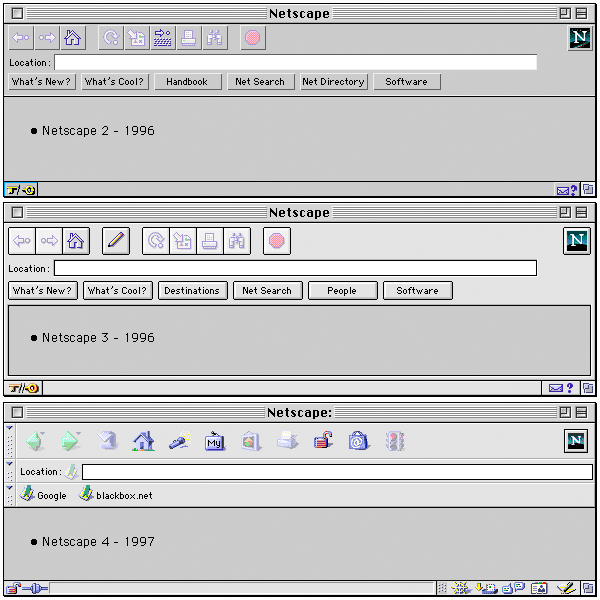
Here's an image of the prehistory: Netscape Navigator 2 and 3, Netscape Communicator 4, all on MacOS. (NS3 is the Gold Edition, as discerned by the edit button in the toolbar. NS4 introduced the bookmark bar, by this requiring more vertical screen estate for the Chrome. Also mind the default grey page background of #CACACA common to all iterations of the Netscape browser.)
Edit: The "Classic" themes of early Firefox and SeaMonkey were still very much reminiscent of Netscape 4, but the toolbar and the location bar merged. (In the early days Firefox and Netscape 6/7 still coexisted in parallel, packaging the same engine, and the "Classic" theme represented the Netscape legacy UI.)
Ah yes, the skeleton screen. Because it’s so much better to have the application in an unusable state, but at least it’s on-screen!
There’s another state that may be related to uBlock Origin (or other extensions) immediately afterwards, too: You can click bookmarks etc. but nothing loads (only after a significant delay). Again, awesome UX.
I guess I’m slowly becoming conservative because I’ve come to hate change. Most of the time, it doesn’t improve anything. And then, with increasing odds, changes actually make things worse. Not just limited to Firefox, of course. Also Windows, macOS, iOS, Android, whatever. Hell, even cars are getting worse every year.
Skeleton screens are a great example of bad design being popularized because a couple people in power set arbitrary requirements. "It has to start fast" is a common requirement (a certification requirement on some game consoles, in fact) which leads to skeleton screens, and it juices certain metrics in a way that appeals to metrics-driven leadership, so eventually you get them everywhere and it hides the fact that your application takes forever to actually load and be usable. There are a few different pieces of software I'm stuck using that will often show me a skeleton for multiple seconds while I wait to actually be able to use the app. Just show me a loading screen and a progress bar.
Some people in the browser space haven't lost their minds and track things like how often the layout of a page changes during loading, how often it wiggles around, etc - which penalizes skeletons and other bad tricks, as it should. But this particular sensibility hasn't caught on elsewhere.
Skeleton screen serves another purpose than just fast startup metrics.
Not everyone runs good hardware, in fact the majority doesn't. When you click to open something and it doesn't load immediately many people will click again and again which leads to opening 2+ windows and also adding to the loading time of the first one.
When 70%+ of the users are not skilled in tech using laptops on battery saving mode this happens a lot.
I used to love change up until about a decade ago. Back in the day, computing was still pushing the boundaries of what's possible and new features could change your life.
Nowadays, the innovation has plateaued and computing became an ad delivery mechanism and a way for employees of bloated corporations to justify their salaries "fixing" things that didn't need to be fixed.
> Ah yes, the skeleton screen. Because it’s so much better to have the application in an unusable state, but at least it’s on-screen!
Precisely. Much better. I know something is happening. And if done well, I can interact with the shell, like use the search box, while the content is still loading.
A skeleton screen is not interactive though. You cannot do anything except watching it pulse or whatever. Keep in mind that the content here is the shell itself.
I also already know something is happening. That’s what the busy cursor is for.
That does make it like a splash screen of old. With extra teasing. I understand the annoyance.
It seems as if only Firefox on Windows has these skeleton screens and so couldn't try for myself. I assumed that much of the shell like search bar, close button, and the menu would be ready.
Personally I think it is actually pretty great. It opens faster so that I can position the window where I want and it loads fast enough that by the time I've actually tried to do anything it is ready to go.
Why doesn't Chrome UI elicit the same reaction from the community?
I get the feeling that many people have, that FF is following suit with chrome in terms of UX (and other things), rather than innovating[1]. There is some truth to that, but I do feel like FF tries out some nice things in their UI.
I'm currently running on FF on MacOS, and I find it incredibly hard to come up with any legitimate criticism of the UI, but it does help many apps that MacOS forces a top menu.
Yes, there are little things, like tabs are now buttons, and container tabs should be easier to use without first reading a guide.
[1] And maybe many vocal HN'ers objection is directed at the mere fact that innovation is attempted.
Chrome's UI hasn't had any massive, radical changes that I remember. Trying to go back to Firefox after getting disdained with Chrome was like using an entirely different browser.
People do get frustrated at Chrome UI changes from time to time, but Chrome (to it's credit I suppose) has always had very minimal chrome for people to get mad at! Way less surface area for people to get mad about, I suppose
Kinda astounding how the firefox v1 was not great but ok, and it got overall worse in literally every redesign since then. v1 remains the best UI firefox has ever had to this day.
No wonder they peaked user share early on and have rapidly hemorrhaged since then.
I feel like it became somewhat popular to bash Firefox (and Mozilla) on HN, which is sad. What exactly did you like about v1? It takes huge space and literally most buttons are completely useless. Are you using "refresh" very often? Do you need a huge "loading" indicator that takes space even when you're not loading? a button to show all-"history"-of-the-forward-button-in-the-current-tab? What makes v1 "the best ever"?
Only popular to bash because Mozilla has been husked and is now a money siphon for the executives while they slowly destroy everything good about Firefox, one bit at a time.
Ummm yes? Funny, I just wrote another comment complaining how hitting refresh on a major airline's flight status page is liable to give one of those terrible "something went wrong" messages (apparently the search results are liable to expire, but until they do, refreshing will actually update the info, so it is useful to periodically press to see if the flight got delayed).
Combining stop and refresh is also dangerous since that's a race condition. Suppose the page is taking forever, I decide I've had enough of that and want to press stop. But in the second it takes me to actually click on it, the page decided to finally load! Now my click, instead of stopping the annoying spinner animation, clears out the information that FINALLY arrived and brought the annoying spinner back.
(I actually think there is a pretty good case to just remove the stop button though, it isn't vital and just hitting back or close does the same thing anyway. But combining it with the refresh button is about the worst possible thing you could do to either button. It takes one useful button and one meh button and combines them into one awful button.)
Speaking of clicks, that's actually the last straw that made me abandon firefox entirely: in version 75, they broke clicking on the url bar. Instead of doing the sane thing - putting the cursor where I clicked - it instead selects all. Before, double click would select all, meaning if you wanted that, it was still easily available. Now double click instead selects... a word. So they completely removed the very useful single click functionality and turned double click into a completely useless behavior. Absolutely unbearable.
I could tolerate or undo most the other UI changes they did, but this click thing couldn't be user style'd away, couldn't be configured away. They just shoved this massive breakage down. So I uninstalled it .
> takes space even when you're not loading
I'd rather have a predictable UI of marginal utility that doesn't change out from under me than a UI that randomly changes from bad to worse in its own time. At least you can get used to consistency, even if it is consistently mediocre.
> What makes v1 "the best ever"?
Don't put things in quotes that weren't actually said. I actually said "v1 was not great but ok, and it got overall worse".
There's actually specific changes I think were good, coupled with other changes that were bad.
I'm sorry I rephrased your text, but you did write "v1 remains the best UI firefox has ever". How is that so different from "the best ever" is beyond me.
What browser did you move to after you uninstalled Firefox because of the click in the URL thing? Seems like Chrome does the same. To me it actually makes sense - I think most of the times when a user reaches the URL they want to put a new one, not to edit the existing one. This behavior makes that easier.
> How is that so different from "the best ever" is beyond me.
"the best ever" implies it is the best.... ever. Inclusive of all competition. "the best firefox has ever had" limits the comparison to just firefox.
> What browser did you move to after you uninstalled Firefox because of the click in the URL thing?
I made my own ui skin for chromium. I'm not terribly happy about using chromium but I couldn't figure out how to use the firefox engine for it - another strategic mistake by the incompetent buffoons at Mozilla not making this easy, and of course doing the whole browser myself is a big job (heck, even the UI skin is a big job, there's a LOT of things still on my todo list, but it minimally works without driving me absolutely nuts which is more than I can say about Firefox's recent versions).
> To me it actually makes sense - I think most of the times when a user reaches the URL they want to put a new one, not to edit the existing one. This behavior makes that easier.
Most the time I want a new one, I'll open a new tab and thus have a blank url. If I'm clicking on an existing url, it is because I want to edit it.
But if I do want to replace it, the old double click behavior to select all made this utterly trivial too: single click to edit, double click to replace. Hell, they even used to have an about:config thing to make single click select all, but in their infinite wisdom, they removed even that hidden config option to turn it back off.
With the new behavior, editing a url becomes quite frustrating. The work around is to click, wait until the double click time period elapses, then click again. Don't do it too soon though, or it will do the completely useless "select word" thing instead. If you click a third time, it will now select all again! Fourth click? Back to select word. You must wait for a while before you can just click to edit.
Oh, and do you use middle click on X? That single click select all... does NOT assert the PRIMARY selection. But double and triple click do! So if you single click it, it looks selected... but it isn't. Double click out of old habit? Now it is wiped out. Ridiculous.
So this change marginally benefits some users (who probably don't really care) while being devastatingly crippling to the people who do. Maybe some utilitarian function can say +1 usability point times 10 million users outweighs -1000 usability points to 1000 users.
But I'm gonna go ahead and disagree. Mozilla is a niche product at this point, maybe they should start caring about the 1000 users they have left.
Compiling firefox is not exactly a trivial process, especially if you want to keep up with updates. And besides, they break something else every other week. I was getting sick of constantly having to fix the userChrome.css too.
Well said. I wish I could upvote this comment more than once.
Many of these changes were done to unify the UI across platforms. Yet using Firefox on iPadOS is an even worse experience than on desktop. Tapping on the URL bar has the same select-all behavior, and it always takes me several taps in order to place the cursor where I want it, in order to change part of the URL. It's absolutely infuriating.
Not to mention that it ignores arrow keys on the Smart Keyboard Folio to clear the selection, so it forces you to use awkward and imprecise taps. /facepalm
And I constantly run into major UI bugs, like tabs getting confused and showing blank or wrong titles; sometimes tapping marks the tab as selected instead of switching to it; sometimes tapping on links inexplicably opens them in a new tab, etc.
How these issues continue to plague a browser as popular as FF is beyond me. It almost feels like it's never tested by developers and designers and updates are just pushed indiscriminately.
I'm considering just giving up and using Safari, since that's what I'm using anyway behind the awful FF UI.
> Kinda astounding how the firefox v1 was not great but ok, and it got overall worse in literally every redesign since then. v1 remains the best UI firefox has ever had to this day.
As someone who's been using it since the phoenix/firebird days, I disagree strongly. There have been hiccups along the way (particularly the tabs appearance in proton), but in general the UI has gotten significantly better with each redesign. Looking back at the v1-3 UI all I can see is how much vertical screen real estate is wasted on things I would very rarely click.
I don't believe there was any way to move the tabs into the title bar and to combine all the file/edit/etc into a single button in the same vertical space as the URL bar. Those are the two changes that make the modern interface so much more compact. Maybe it could've been done with extensions.
The argument is similar to that with any major UI change - I have one coworker who still complains about the Microsoft Office Ribbon UI. For casual and newer users, the old office UI was tedious and cumbersome hunt down whatever you want from the dozens of icons and buttons. The newer layout may require several clicks for power users to do something they used to do in one. I found it mildly annoying when it first changed, but I committed to it and now I find it much more usable. Same situation with Firefox.
I hate the tabs in the title bar. The bar is for the title. How do you drag the window on the screen now in standard OS you grab the title bat with the mouse and drag.
But then again I must have vertical tabs so ideally just kill the tab bar.
I almost never drag a browser window, it's always full screen. Occasionally I want to switch it from one screen to another, I just grab an empty space on the title bar - it's never been an issue for me
I have zero use for an actual title bar - it's a waste of 24 vertical pixels
The "Classic" theme was still very much reminiscent of Netscape 4 (just reworked icons and toolbar and location bar were merged), while the "Modern" theme was much the same in layout but introduced round buttons of varying size. (Firefox came with both themes.)
The great thing about Firefox before the Photon addons apocalypse was that anyone could theme the browser in whatever way they wanted. Sure, it's still possible, but userChrome is a messy hack that Mozilla are trying to get rid of any moment now.
Soon, we'll be stuck dealing with whatever UI Mozilla feels like implementing for the current week. Thanks for your efforts for now at least.
I'm fond of that capability as well. Still it was good to restrict things for security and support reasons. Preserving the integrity of the line of death is hard enough without arbitrary UI changes and interactions among X different add-ons.
call me orthodox/traditional, or just a creature of habbit, but for most of my adult life, i've just kept a userChrome.css which reverts the current firefox ui/ux du jour back to the classic netscape/mozilla suite xpfe interface (w/ a jwz-inspired throbber, just for fun)
i value productivity above all else, so over the years, I've found that a familiar interface that i have muscle memory for is the most important aspect of browser ui/ux, imo
Looking through all these designs, I'm reminded how much I liked Vista-inspired themes like Firefox adopted. Curves, transparency, fancy. Not the most energy efficient or easiest on the eyes, and I'm not actually a fan of transparency in general because it makes stuff move that you're not meant to be looking at (e.g. if the page you're scrolling on slides below your task bar, it's not useful to be distracted by something on your task bar moving), but it was the prettiest in my opinion.
What browser GUI do people, here in the HN bubble, look at and click on?
I look at the URL for the hostname, look at tabs to find the one I want and sometimes click on it (more often I use ctrl + pagedown/pageup), click on a certain extension GUI regularly because it lacks a keyboard UI, and that's about all but the edge cases. Everything else is done on the keyboard and sometimes the mouse scrollwheel (when presssing the spacebar doesn't work).
My guess is that browser GUI design has limited impact here; website GUI is a far bigger factor for me.
Changes which the user did not ask for and did not want are NON-CONSENSUAL.
Non-consensual changes foisted on the user are par for the course in proprietary software, but they should absolutely not be a thing in FOSS.
If the developer can repeatedly force non-consensual changes on users without any recourse, that means the project is not healthy and needs to be forked.
If it cannot be forked, then the idea of it being a FOSS project can be safely interred and a tombstone placed above it.
(Still using Firefox 3.x on occasion and ensuring my sites work with it.)
Contrary to the modern interface philosophy as there is no abstraction
Modern interface philosophy means that if you don't use something every day you have no fucking idea what it does anymore. For example, every time I use the desktop Gmail interface I have to wait for tool tips just to figure out which inscrutable icon does what.
Agree. I disliked the tab design of Australis (but remember being able to remove that curved nonsense) but Photon was great (until they started to mess with url bar dimensions etc).
I've just learned about Proton being distinct from Photon.
Of all the names they could've used, they chose one that's one Levenshtein distance from the previous. Looking forward to the next redesign dubbed Protan.
Talking about Pocket... do you remember how more than five years Mozilla promised to make it open source? Five years and this proprietary service is still integrated with Firefox.
Modernity and simplicity is nice an all, but the Proton redesign process was a big failure in my opinion. I've heard nothing but annoyances from basic users about the weird tab display, and many advanced screens (like in the settings) are being disappeared for the sake of simplicity without an equivalent implementation. The redesigns are welcome but left unfinished.
Up until around Photon, I considered every UI update an improvement. Photon itself was a bit of a mixed bag, but mostly contained improvements. That marked the turning point for me; Photon is where I actively started disliking the more prominent features. Unlike Photon, Proton was just a huge step back, with no real improvements to compensate.
Trying to get details about a TLS certificate, something only power users do and even then is done very rarely, is now a full page ordeal, with a small column down the middle of the page for content. Apparently the popup was too clumsy or something? I seriously don't understand why any UI designer ever cared. Everything is now bring dumbed down, information that doesn't satisfy the top 80% just gets completely removed and the space saved is dedicated to padding and margins making the entire UI more bloated.
Then there were dumb plans to make Firefox interesting (I think? What else were they doing?) like the idea of "colourways" being available for a limited time only, which was simply preposterous. Earlier they took over Pocket, a service everyone has now seen the icon for and barely anyone ever uses. When it comes to decisions about the browser, everyone who dares reduce telemetry gets ignored . Mozilla brands itself as a privacy aware company, but when you try to use that privacy it turns its back on you.
I suppose I should be thankful Mozilla isn't trying to ruin Firefox in desktop as much as it's trying to push users to abandon Firefox on mobile. My tab bar has gone through three changes I don't really give a damn about, collections have come and gone, and I've given up on ever using the addon API again. The text encoding settings and menu seems to have inexplicably disappeared, leading to some very annoying broken web pages that can't be fixed anymore.
You can't even enter an IPv6 address on Android. The browser engine can browse to IPv6 addresses just fine, the URL bar just doesn't accept them. The regex to determine if an input is a URL or not doesn't test for IPv6 and the single attempt by someone else to fix it was apparently too complex and therefore removed later. That person abandoned their efforts and the whole process doesn't exactly make me want to contribute either.
In my frustration I've actually considered (and quickly dismissed) the idea of writing a tool to spam Mozilla with telemetry to get the features that I use more hits. Telemetry warfare, of sorts.
> it's trying to push users to abandon Firefox on mobile
The funny thing is, extensions are completely functional on mobile. All you have to do is:
1. Create a collection at addons.mozilla.org containing exactly the addons you want
2. Install firefox for android, developer edition
3. Sign in to sync
4. go to "about firefox" and tap the logo 5 times
5. select "custom Add-on collection"
I quite like the new certificate page, the information is a lot better presented than the previous tiny window where the information was in weird nested panels and harder to find. It's a lot easier to search through the cert info now.
That was more likely marketing having nothing better to do, just like what happens when designers are left idle. They need to justify their existence somehow.
> Then there were dumb plans to make Firefox interesting (I think? What else were they doing?) like the idea of "colourways" being available for a limited time only, which was simply preposterous.
Nothing about this—the feature, and especially how they publicized it—made sense to me at first. Themes? OK, old feature, nothing to get excited about and I didn't even know they'd removed it in the first place, but sure. Limited time? Uh, what? Big announcement and interrupt my browsing session with a big ad? For a feature that wouldn't have been novel 25 years ago? None of it made sense.
... until they did the Disney tie-in colorway, at which point it all made sense. The original push must have been to generate "engagement" stats to show to potential advertisers, using a media push and user experience similar to what one would see for a paid advertising colorway.
Peak Firefox UI was when the "close current tab" button was always in the same place and I could do it with muscle memory instead of hunting for wherever my current tab is on the list.
You probably know this, but Ctrl+W can be an alternative to close the current tab since those buttons won't move. Or using mouse gestures (blast from the past I suppose, but e.g. I use the 'up' and 'down' gestures to scroll to the top or bottom of a page very often).
One of the design feature I abhor in Proton is sound icon in tab. Its too confusing for my peanuts brain. Further, it add text "Playing " which looks redundant.
Missed still! On large screens I prefer a permanent status bar with useful info persisting, than a URL flashing over the page. Chrome did it first, then Firefox copied like a mirror. The status bar was oddly banished to UI hell, not even a config switch lifeline. Replaced with google's flickering lower left overlay.
https://github.com/MrOtherGuy/firefox-csshacks/ offers a nice collection of CSS hacks to customize the appearance of Firefox and to restore some design elements from previous versions. I use it for example to get a usable tab visualization again.
That's the exact opposite of what I like. How can you drag the window if there's no place to click without activating something? My monitor has plenty of vertical space.
...which just shows that there's no one-size-fits-all, and that being able to customise the UI is a very important feature.
I just use keyboard shortcuts to snap the window to left/right side or to expand again. I've been pretty happy with this arrangment and never need to drag the window manually.
Sure, UI/UX can be a whole science, but in the end, a lot of it boils down to preference. As you can see when reading through this comment thread.
My personal biggest pet peeve: I hate, Hate, HATE that they changed the default behavior of clicks into the address or search bar, from simply "put the cursor here" to "select all". Oh my goodness, do I hate this, even after all these months. It breaks a fundamental behavior of text fields since, I don't know, the beginning of time?
Even today, I don't know how many times I keep inadvertenly deleting the contents of my search bar when all I want to do is add another term at the end. My brain is probably just too old to learn something new, I guess.
Also annoying: with the new add-on system, you cannot even write a plugin to restore the previous sane behavior.
On FF desktop it doesn't bother me too much, but on iPadOS Safari I was having quite a challenge editing a URL param due to selecting all on touch with no obvious way to switch to cursor mode (!).
My solution: touch to select all, touch again to reveal sliders, drag the (only visible) left slider to the right to reveal some unselected text, touch the unselected area to get a cursor, touch+hold to drag cursor to end of URL, edit URL, profit! I've seen easier puzzles in puzzle games!
The default value is always necessary, so it is worth studying.
However, I agree that the different preferences should not undermine the possibility of customization.
I really like their UI for desktop. Has anyone managed to package their latest UI into a framework that can be used like Qt ? I remember they had an XUL based framework but I understand it's deprecated now ?
One of the things I don't really like about Proton was the removal of the "Compact" density. ...You can add it back in with a flag... but I have no idea why it was removed
I have been using Lepton since the beginning. Currently browsing this page with Lepton! Thank you for making the theme and a detailed history of FF theme.
I haven't had any major issue with Firefox's UI lately, as long as they can let me show the menu bar.
However, the scrollbars since v98 are a big issue, they no longer follow the system UI (I'm using KDE Plasma on Fedora) and sometimes they take the same color as the web page background, making them invisible. Unfortunately there doesn't seem to be an alternative other than the n-th Chromium-based browser.
I tried to use Firefox v47.x as long as possible. For whatever reason it seemed like the most stable and user friendly.
I’ve never been able to leave hubdreds of tabs open in Firefox for any length of time. Eventually it will consume so much RAM or crash. Any Chrome based browser seems to handle hundreds of tabs open for days at a time without any problems.
I really miss it, being "less tall" means I don't have to move the cursor so much to reach any submenu. But mostly, I miss having the dropdown menu on the left. Why doew it have to be fixed on the right? If I miss-click it (and it has happened me more than once), I close the whole window!!
Thankfully however I don't care too much because I can still completely hide the tab-bar with my userChrome.css, and use "Tab Center Reborn" to have my tabs on the side instead.