The subpixels are entirely hidden on any display that isn't complete garbage. I just had a look at my phone screen through a good zoom microscope and I needed at least 8x magnification before I could start seeing hints of RGB color. At the same level of magnification, I can easily see individual grains of toner and strands of wood fiber on a printed page.
The "existing convention" is a legacy from the days when 72ppi was accepted as the "standard" display resolution. Anything with an acceptably high-resolution display can do whatever it likes with the subpixel arrangement and it won't make a bit of difference.
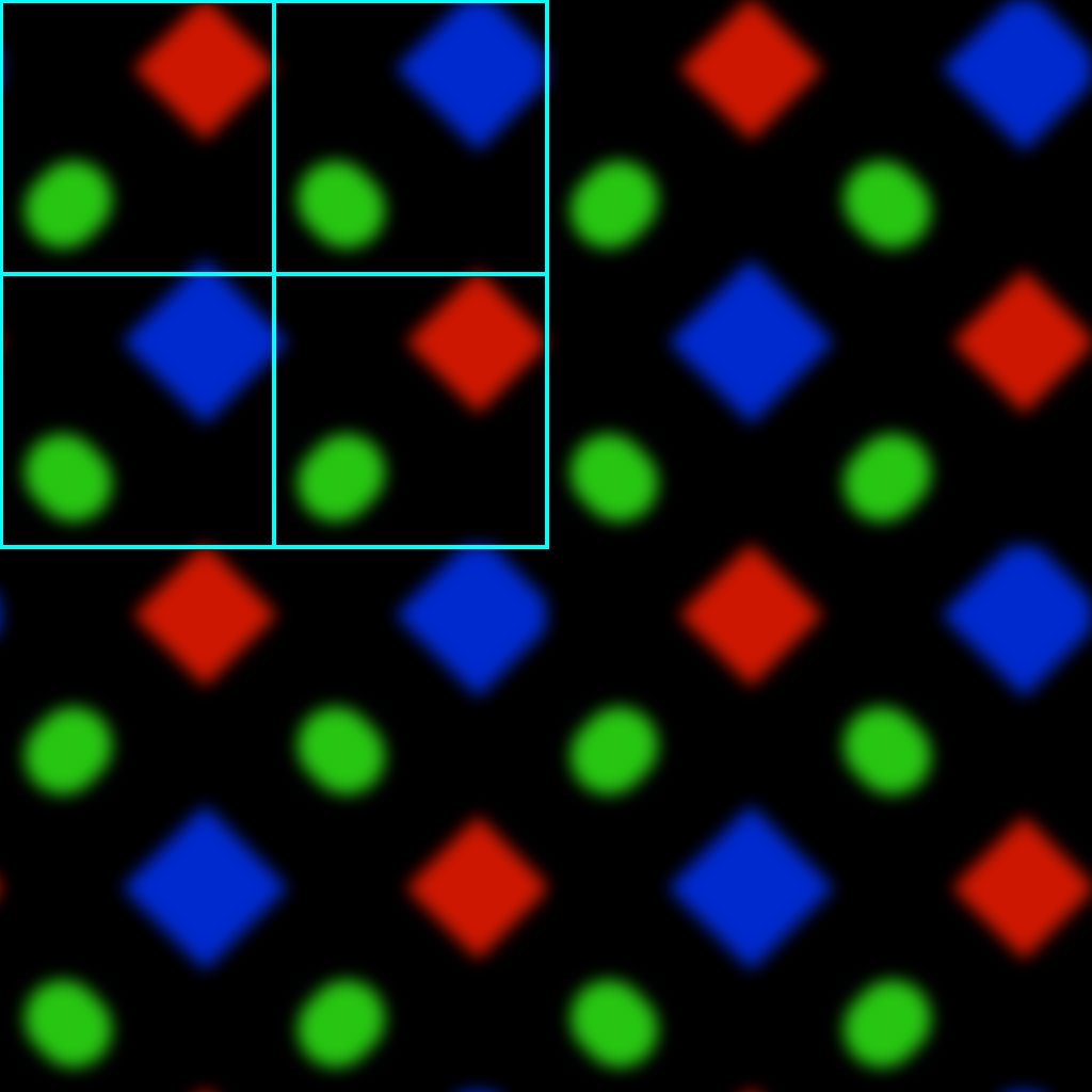
This layout has the distinct advantage you can rotate the screen with everything remaining the same (font hinting etc.)
Varying subpixel layouts are one of the major reasons I struggle to take the obsessions of "pixel perfect" designers seriously [1]. It is the kind of notion you can only advocate if you're ignorant of the reality of what is going on. Display aging and resulting color inaccuracies make this even more fun.
[1] Not helped by having worked on products where the designers quoted 25 years (not a typo) as the time required to support all the supposedly necessary profiles, and the resulting build size would have been too big and so we lost a multi million dollar opportunity. Of course anyone opposing this was simply an enemy of quality.
Edit to add: for those unfamiliar https://en.wikipedia.org/wiki/ClearType was a very sneaky way to take advantage of the fact that the subpixel layout dramatically alters the outlines the viewer sees.
It's actually because of ClearType that I hate screwing with layout.
This doesn't really effect the iPhone, but a lot of apps completely ignore your intended subpixel layout. Windows or X/Wayland can be set correctly, and many apps do handle that correctly, but many don't.
Many enable subpixel hinting when it is clearly disabled by the user. Want greyscale because your monitor fringes hard? Too bad. Want aliased because it is a low resolution display or you hate fuzzy fonts? Too bad.
Also, many apps do detect correctly, but only detect your primary monitor, not the monitor the window is on. Doesn't effect you if you're single monitor.
And to further shit on broken apps: there are apps that are already using DirectWrite on Windows, and are force overriding the correct (default) settings. Why?!?! You were so close!
And to shit on the Internet as a whole: people screenshotting text for their websites that have Vista-era Cleartype tuning clearly in it. Isn't so bad on RGB monitors, but almost unreadable on BGR or any V orientation.
And one last insult: DirectWrite and Freetype only support RGB, BGR, VRGB, and VBGR. There are many other weird ass configurations, such as LG C2s having RGBW (which causes extreme haloing on text), and another OLED panel (forgetting which monitor) has RBG (why?!).
So screw it. I won't use non-RGB monitors until we live in a world we're doing 300% DPI equivalent (ie, 5760x3240 in a 24"; best I can get in a commodity is 4k in 24", or 200%), and I can't see the subpixels anymore no matter how much I squint.
This is a great example for all the edge cases one has to deal with when shipping software, especially when rolling your own solutions rather than using the OS's frameworks.
All of this complexity actually makes me quite happy that Apple doesn't even attempt to do sub-pixel hinting anymore. Finally no more weird colors when zooming in on text.
I've dealt with this on Windows and Linux, and on Linux it was even worse. There I usually had to turn it off altogether.
It was never an issue on Macs for me though, even before "retina" resolution was a thing. Which by the way turned out to be a genius way to solve the issue, even though people didn't realize at the time.
However, I also remember that many people just didn't notice or didn't care. Completely fuzzy display and they just thought that was how it was supposed to be. In the XP era, people would just set the screen resolution lower to something like 800x600 to trade subpixel fuzziness for regular fuzziness.
VGA cables and later cheap VGA-DVI adapters didn't help either. You got VGA fuzz plus subpixel fuzz, total mess. Fun fact: Just last year I sat down at a shared desk at work and noticed a slight fuzziness, and after some investigation saw there was a USB-C dock -> VGA out -> HDMI adapter horror-show going on. Nobody noticed!
Do people still worry about “pixel perfection”? It made sense in the era of low resolution displays, but with everything super high PPI these days, it seems like it typically doesn’t matter.
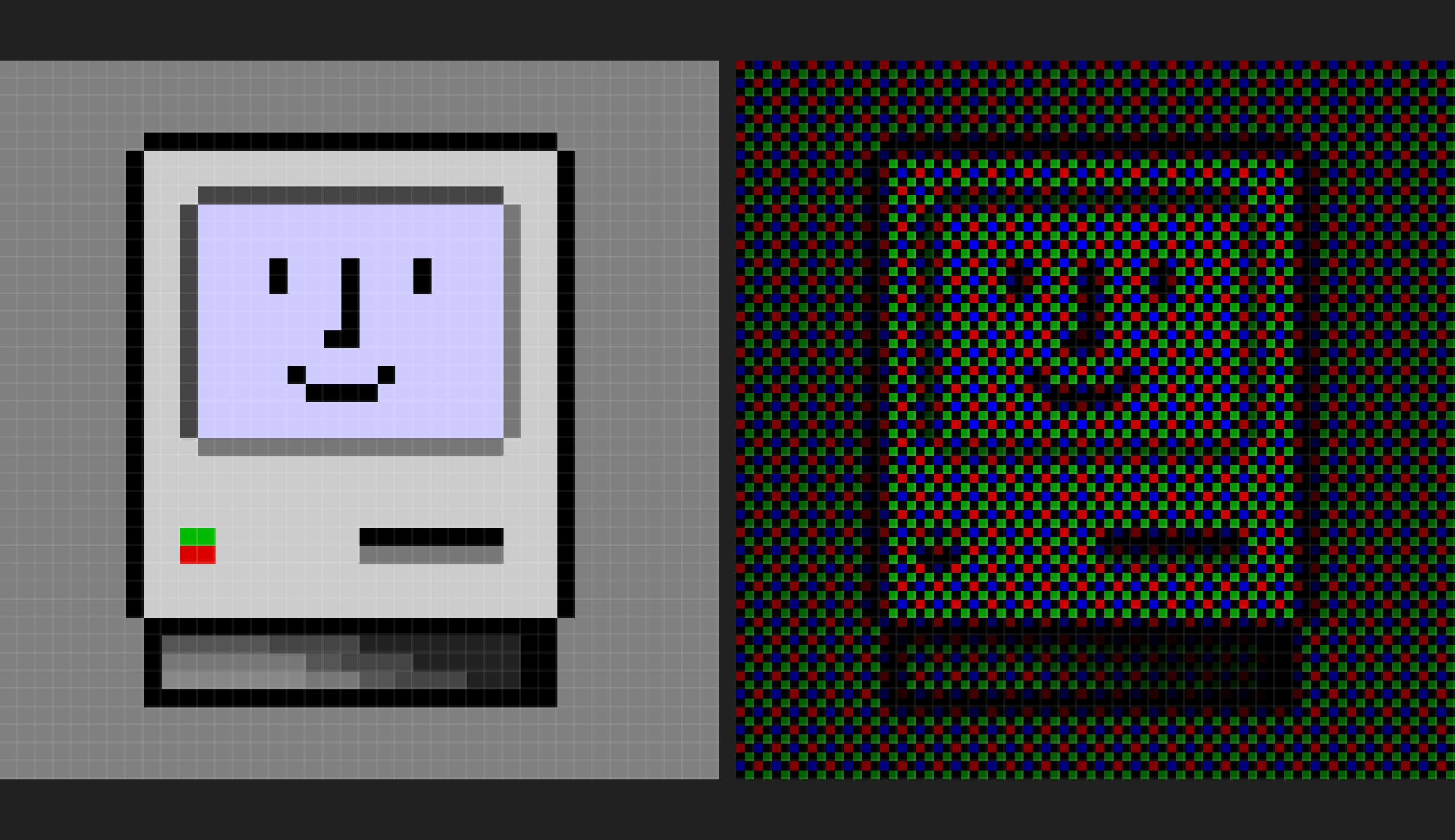
The colour tinting of the mac icon and folder examples implies that their code isn't accounting for gamma curves properly, I might see if I can contribute a fix.
The screenshots shown in my post were from an older version. The current version should work correctly.
The purple tint was coming from naïvely multiplying the red and blue channels by 2 to try and compensate for the fact that you have half as many subpixels of R/B to work with as compared to the green channel. My new approach cuts the maximum green brightness (after converting to linear gamma) instead.
Ah, good to know, I can see the gamma compensation in the green division. fwiw you should probably also convert to linear before doing the bilerp, and back afterwards, but that matters comparatively less.
I love this.
I tried doing sub-pixel simulation for a tool I created (screenstab.com if anyone’s interested – yeah I know, shameless plug, etc.). I ended up abandoning the sub-pixel aspect in my shader because of the distracting patterns caused by the Moire effect.
I'm not sure if you are joking or not, but in case you aren't, your iPhone won't let you directly address subpixels, so no.
There's a whole subcategory of beautiful bugs caused by recursive algorithms going way farther than their authors intended - it probably doesn't apply here.