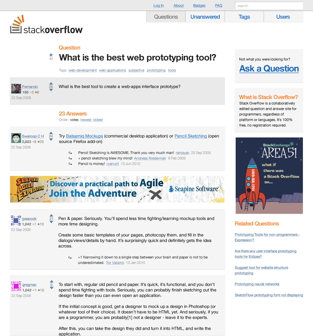
I don't like his interpretation for several reasons:
1. When I log into stack overflow, the status bar
at the top usually contains information I want to know.
2. The use of negative space is better, but the question title and question body seem to be too separated from each other. The question body looks too much like an answer, and their isn't enough differentiation between the two. In the original design, the tabs and the line clearly separate from the answers.
3. He seems to have gotten rid of a lot of the statistical information about the page. I use this information to decide on the value, relevancy, and recency of a question. It's kind of like Github, one of the first things I do is check the network graph, and see how healthy a project is.
4. The votes are too small in his new design. This is a critical aspect of the site, and allows visitors to make snap value decisions. It should be large, it's at least as important as the entire body of the message.
In general, his design looks better and is less busy, but would kill the overall usability. Stack overflow is useful because of the information density, not in spite of it.
I think some people have focused too much on his mockup rather than his point - Stack Overflow's design is poor, with some very bizarre decisions. He only touches on some of the problems with the site.
Let's take the bright orange banner at the top of the screen that appears only to new users.
Obviously, it's not just new users that see it. It's anyone who hasn't got a cookie on their browser indicating they haven't closed the ugly bright orange banner before, so it's hitting plenty of people who know this information already.
But let's ignore that, and ask whether it does the job: how useful is the information contained in the big ugly bright orange banner to new users? Not very, I suspect. For most users, the purpose of the site will be implicit - from context (because they did a search for their problem and were linked to it), from the design (it looks like a Q&A site), and from the content (questions and answers). If it's not implicit, then the exact same information is explicitly stated in a box on the right-hand-side of the site. No other popular modern site on the web does these sort of popups anymore, so I don't see why the creators of Stack Overflow thought they were a good idea. In addition, why does the big ugly annoying bright orange banner link to the FAQ? What pecentage of new users will ever want, need, or read the FAQ? Users don't read anything. If the idea is to encourage sign-ups, then create a sign-up link, not a link to something nobody will read.
Then there's the functionality of the big ugly annoying intrusive bright orange banner. It loads after the rest of the page loads, then shifts all the elements of the DOM down. Just in case you'd missed the bright orange banner that distracts you while using the site, it scrolls with you, displaying on all Stack Overflow pages until you're forced to go out of your way to move your mouse to close it (with their weird 'close' icon), when finally (if you're near the top) it shifts the DOM up again, just to ensure it can be maximally irritating.
I don't see how "you’re seeing the one-time new user screen layout" should be regarded as any sort of defence for the big ugly annoying intrusive distracting irritating bright orange banner. Do new users somehow deserve bad design and bad functionality?
In my eyes, Stack Overflow has firmly been a success despite its poor design. It's not as though Experts Exchange set a very high bar to beat usability-wise.
Let's take the bright orange banner at the top of the screen that appears only to new users.
This is not displayed to new users only. It's also used to give registered users alerts about new answers to their questions, comments on their answers, changes to questions they are following, etc.
Seems to be a general purpose alerting/messaging feature which was then brought over to drawing attention to "new" visitors about what SO is.
I do agree that the "improved" mockup is easier on the eyes than the current Stack Overflow design, but I'm not convinced that Stack Overflow's success is "despite its poor design".
Maybe Stack Overflows... umm.. how shall I put this.. distinctive design is actually part of whats made it so successful. I mean, let's face it, when you're googling around and land on a Stack Overflow page, you KNOW you've landed on Stack Overflow, even if you weren't paying attention to the URL. It's look is definitely distinctive and unique. Maybe that's more important than being pretty. It does seem there are a lot of famously ugly sites that are also famously successful (CraigsList, PlentyOfFish, etc) I'm also reminded of the recent HN post about those long ugly salesletter sites, and how they convert much better than attractive web 2.0ish sites.
Maybe (for web sites), being pretty isn't all it's cracked up to be?
> Maybe (for web sites), being pretty isn't all it's cracked up to be?
Being pretty isn't much, but actual usability of SO is quite poor. I've used it since the beta and I learnt about some functionalities through this analysis, that I missed because they're so badly laid out!
I'm pretty sure that stackexchange-based sites NOT targeted to highly technical people will fail, because of the extremely poor UI.
It's also not obvious that the orange banner won't come back next time you visit the site. I've never closed it before today because I assumed that it would just come back next time, so there was no point in closing it.
I can see how it could be annoying for new or low-engagement users. But for me (and I imagine many other regulars) I love seeing that bar. It means something good has happened on something I care about. Someone answered my question or commented on an answer of mine or I got a badge or something else I'm interested in. It never shows me things I don't care about.
> rather than his point - Stack Overflow's design is poor,
Well, that's supposed to be his point. But saying something is "poor" because it doesn't match your personal taste isn't really much of a point and will never convince anyone. And nobody is obligated to provide a "defense" for not liking your favorite color.
"To my ears, the Rolling Stones succeeded despite that the fact they are poor songwriters and Mick Jagger has limited vocal range"
comments like "I’m happy to be proved wrong on this, but who actually clicks on these tags...I’m not a fan of tag clouds" are pretty subjective criticisms of the user interface...
I'm sure an objective measurement of how often the tags were clicked would prove him wrong.
As he observes himself, any UI-centred redesign should be based on metrics and user testing. Redesign in a vacuum is much worse than design by developers.
Agree. SO is a really busy, 'kitchen sink' design that looks like it's been given a thin coat of CSS by programmers. It looks spartan in a way that suggests the authors are scared of using anything 'fancy' due to not knowing what would work stylistically. I use SO, so it isn't a deal breaker for me, but I feel it could be so much better.
I was going to agree entirely with eplanit's comment (that this post is merely a vent for the author's ego), but I literally felt a wave of relaxation when I looked at his mockup. It's probably not perfect, and it probably has some flaws compared to the use case of the current site, but man, looking at it makes me feel like I'm kicking back at the beach. What a difference.
Interesting article, but I largely disagree with it. A big part of my problem is that he doesn't talk about the differences between new users, and regular users.
Most of the users who simply read content, are looking for an answer to a particular question. Chances are, they're coming from a Google search for a specific problem, and SO has the answer. Their actions and expectations are geared towards finding the answer as quickly as possible. I can't say for sure, but I think most users don't have much problem seeing the question or scrolling down to see the first answer. They also probably realize it is the "best" answers by the score next to it.
On the other hand, you have the regular users. Most regular users don't see the ads which bombard the newcomers, which already removes a lot of the ugliness from the screenshot he posted. Also, as a regular user myself, a lot of the other stuff he claims is "useless" is very important: the info bar at the top, the rep scores, the tags, all of it.
I'm not saying Stack Overflow is perfect. But to understand its design, you first have to understand the different users who come to it, and analyze whether the "off the street" user manages to find their answers or not, and whether the site is good for the "community users" (obviously it is, considering its success).
By the way, if anyone is interest, Jeff himself comment on the blog.
I use stackoverflow a lot and I'm a "designer". I find the original UI to be more utility-focused and information-rich than his interpretation. His interpretation also lacks the presence of authority, which I think the original UI does well by emphasizing numbers (votes/views) and colors. My 2cents.
(First let me say that I admire Jeff Atwood and his work. That doesn't mean he has made no mistakes.)
Jeff launched this thing by tuning it for what he wanted in a Q & A site. Since he is exactly the sort of early adopter they needed for the first one (for programmers) that worked OK. But now they are launching a fully baked, "Jeff-tuned" product to other populations and I think there will be problems. The problem with an overloaded page is that you've closed off your options - you've made it really hard to iterate. Because every piece of available space is filled with information it's very difficult to test the product with new users.
This happened partly because this is every programmer's instinct, and partly through Jeff's misunderstanding of Edward Tufte's concept of "information density". Somewhere in a Stack Overflow podcast Joel is telling Jeff that there is way too much stuff on the page and Jeff defends that as being an example of information density that Tufte would like. Not true - a vector field has information density: http://www.google.com/images?q=vector%20field When you can apply a single (simple?) rule to understand a lot of data, that's information density. By contrast, Stack Overflow is like any web page in that each element must be examined in turn to be understood. That's why you must eliminate elements ruthlessly, especially when you are starting out.
Well cited -- the actual post I was referring to is http://www.codinghorror.com/blog/2006/07/information-density... and the relevant quote is probably "Is it a victory for information density? Maybe. I think Craigslist is conceptually pretty close to what Dr. Bronner was doing."
Well, it looks like I'm wrong about what Tufte meant by information density. In that case Tufte wouldn't say that information density is the only thing. "Every pixel doing work" != good design.
But I definitely heard that exchange on a podcast.
This is actually an interesting article in the sense that SO is also designed --FOR-- developers, which is why the "negatives" haven't hindered usage of the site.
As the article's criticisms have some validity, I do wonder - does Stack Exchange need to revisit the information architecture of the original code if they want it to be the Q&A platform for the masses?
It seems to be working for cooking subjects, too (http://cooking.stackexchange.com). That might just be because it's overrun with geeks right now. There's a pretty strong overlap between code and food hacking, so that could help explain it.
I would consider my wife a foodie (a baker not a chef). I thought she might like the site (she enjoys answering questions about the recipes that she posts on her site). So I pointed her to it, showed her the basics, and left. Came back about 30 minutes later and she was trolling through other food blogs answering questions in comments.
She tried to up vote an answer and got the yellow box (Login or register). She ended up on the OpenID page and couldn't find where to put her e-mail or password. She has a GMail account, and I told her she could click on the "Google" icon.
She found the "Click here to sign up" link, but that just sent her to MyOpenID. A site she'd never heard of. And I've grilled it into her not to create accounts on sites she hasn't heard of or hasn't been recommended by someone or that she was redirected to.
So the site has some novice computer user problems. In my wife's defense, she is a great photographer, baker, and has several master's degrees in science (even worked at JPL for a bit on the Mars rover that burned up in the atmosphere). But she is a complete novice when it comes to computers. And the site turned her off in about 5 minutes.
I don't normally swear in Hacker News comments, but it is such a fucking tragedy that we still have this problem, especially on StackExchange sites owned by people like Joel Spolsky and Jeff Atwood who should really know better.
1. The majority of users will have a very specific interaction with the site: finding answers to specific questions via Google, and that's it. Most users have no interest in being part of a "community" around these topics.
2. I agree that OpenID as a requirement is annoying, it even stopped me from using the site for a long time. But Jeff and Joel are sticking to OpenID on principle, because they believe it is a better way of doing things. Can't really get mad at people who "sabotage" a bit of business to stand up for something they think is right.
I don't think it should be such a pain in the ass to register, even if the majority of users "have no interest" in being part of a community. How does making the sign up easy screw up the experience of those not wanting to sign up?
I too found registering with open id confusing. I actually searched around the web how my openid url should look like and pasted it in input box. It didn't occur to me that Google logo below might be a button that will do that for me.
Not to mention that when she does log in, she'll find out you can't upvote unless you have a certain amount of karma or whatever equivalent (that was my experience with the site).
I really liked that in Hacker News, being able to vote right from the start.
This is one of the big design problems IMO. Features that aren't usable should either be hidden or very obviously marked as disabled. The voting buttons are exactly the same for everyone, even though they're useless to most people. Whenever I find a new StackExchange site, I instinctively try to vote up good answers and get the annoying "You need more rep" popup.
StackExchange as a platform is going to face an uphill battle if they don't rethink their entire strategy.
The Area51 'vetting' process is an unnecessary barrier to creating new and interesting 'exchanges' (I guess it makes sense from a cost perspective), and they need to adjust the user experience for the non-geeky universe.
As they view it, it's not an unnecessary barrier. It's there for a few specific reasons: 1) Make sure there is enough interest to get the site going. 2) Build up momentum for the grand opening.
Don't forget, all these Stack Exchange sites are thought up by the community, but then deployed and paid for by Stack Exchange. They don't want hundreds of "ghost towns" around the web, they want to only create a new site if they think there's a reasonable chance it will grow into a site as vibrant as Stack Overflow. That's what the whole process is about. Time will tell if it's a good process.
Yes, they're paying for the infrastructure. That fact is not lost on me.
But think about the real costs. Assuming that they have a nice scalable multi-tenant design, a ghost town is not going to have a lot of content or users, which means only a small hit on their database. Yes, tons of ghost towns add up to significant costs, but that can be easily fixed with some simple rules around inactivity over a set period of time.
Wayne Gretzky famously said "You miss 100% of the shots you never take." StackExchange is taking a 'rifle' approach. More power to them. My own personal opinion is that a 'shotgun' approach could result in more successful sites than the one they're taking. Just my 2 cents.
Jeff has actually spoken about this a few times. The ghost sites do have a cost beyond just resources. The stack exchange format only really works when you get a certain critical mass of people to ask questions. They have found if you get people together and people ask questions then people will come to answer them. The trick is getting enough people together to start asking questions.
When you have an empty site and someone sees the last question was weeks or months ago they just browse away. Helping getting the community over that initial hurdle is important.
Has that particular StackExchange has become a serious destination for foodies?
They don't really have content that can't be found elsewhere, and my experience with other food sites (all recipes, martha, chowhound, etc.) isn't nearly as annoying as it is with SO's competition (ITToolbox, Experts Exchange).
The only place that I've seen cooking.stackexchange.com mentioned is on geek sites like Hacker News, and Joel's RSS feed. They've got a long way to go before I would consider the cooking site a success outside of the nerd community.
Oh wow. That cooking stackexchange is hideous. There is no visual connection between the topic and the design - why use blue gridlines and pencil shaded widgets for a food and cooking site? It seems more of a drafting or a tailoring site. I don't need fancy backgrounds or images, but perhaps use the site colour scheme to allude to the wonderful colours, senses, flavours, tastes, and pure enjoyment that you get from cooking and eating.
For example, chowhound uses small splashes of red to give their site some "flavour".
There is no joy in that cooking stackexchange. It is like cooking for computers.
It's beta. That's how the other beta stackexchange sites look like.
That's part of the problem.
If you look at the StackExchange FAQ, this is what they say about the Beta phase:
Beta. Perhaps the most important phase. This is the actual, live site set up on a "probationary" basis to see if people will use it.
If you can't customize the user experience in a manner appropriate to the subject matter, you're being set up to fail. That's why I personally have a strong dislike for the Area51 'vetting' process.
The idea isn't to customize it now. It's to customize it together, as a community, during the beta phase. Remember that the site is about a week old, most MVPs don't look nearly as good on their first week, nor have nearly as much traffic driving them right away.
Right but which community is going to customize the cooking site? It won't be foodies who aren't terribly techie because they'll be turned off immediately and won't pass go. So it will be developer types customizing it, even though the potential audience is so much wider.
I'm not sure that's a real excuse for a cooking site to look like that, even if it were in beta.
But I accept, perhaps the people who run the site didn't have time (or money) and just applied the default templates, and tried running it to see whether it will work.
More seriously, the link above shows how early on Jeff Atwood got design input from the people who use the site. Jeff's comment on Dan's critique also show how they continue to work with the users on design, and they've hired a designer, Jin, who also commented.
The post is like a small version of the American Airlines design critique post from a while ago, complete with a polite explanation of why the design is the way it is.
I should have stopped reading at "my eyes puked from the motion sickness.."
Seriously? What a horrible way to tear apart someone else's hard work.
An actual case study of Stack Overflow would be that something designed by developers could be a huge objective success.
Also, his proposed improvement "hasn’t included all the functional elements yet" Anyone can make almost any interactive design appear to be superficially better as a static screenshot by taking things away. As far as making something that actually works and does the right thing, that takes more than Photoshop and arrogance.
If you look at the (in)famous design criticism articles of the past year, you can see that discourtesy has become a pattern. Because these got so much attention, others started to think it's "okay" to do design critic in a similarly childish and discourteous manner. It's interesting to see the lengths people go for attention.
Tyler Thompson on Delta's boarding pass:
"It was like someone put on a blindfold, drank a fifth of whiskey, spun around 100 times, got kicked in the face by a mule (the person who designed this definitely has a mule living with them inside their house) and then just started puking numbers and letters onto the boarding pass at random..."
Andrew Wilkinson on Zappos:
"I checked out your new website and wanted to stab my eyes out with a sharp object."
Dustin Curtis on American Airlines:
"Fire your entire design team, if you have one."
(His original post was harsher but he has edited it since and I don't have access to the original.)
I really like reading design critics like this one. It's detailed and most points are well supported. I stopped reading though when the OP offered his "better" version.
It's not that his version is bad but redesigns by outsiders necessarily introduce their own new flaws. They don't know what constraints drive a specific design, so there's little to learn from a mockup that fixes, say a white space issue, but did not consider if usability or conversion rate could be impacted.
The "stopped reading" jab is getting kind of tired. Really? It was that offensive that you couldn't bear to read another sentence?
If you had, you might have realized that the guy acknowledged straight out that his admittedly uninformed re-design would probably introduce it's own flaws, but that the main point was to show how some of the flaws he did identify could be addressed, not as some evangelical "better" version.
It wasn't offensive and I wasn't offended. Sometimes it's a better use of my time to stop reading an article half-way.
Anyhow, this post is in the same vein as the AA redesign by Dustin Curtis. The criticism is interesting and useful. The complete redesign attempts are however a step too far. IMHO. You can't suggest solutions to identified flaws by completing changing the parameters of the problem.
(I'm not specifically talking about OP here, it's more about redesign posts in general.)
No matter what your criticisms are of the finer points of his critique (I agree with some, not others), the OP mocked-up a much better concept for the site. (IMHO)
I think it looks hideous - it reminds me intensely of phpBB, with the author icon / info etc. on the left, and the stench of phpBB is definitely to be avoided (IMHO).
Keep in mind the author-icon/info-on-left concept isn't exclusive to phpBB, it's used by most forum software. It's used so frequently because it's what the user expects which is what drove this layout: making the site easier to use for first time users coming from Google.
Personally, I'd much rather be compared to phpBB than SO. PhpBB has a proven track record as one of the most powerful and widely-used forum tools on the web. SO is still young, and could very well peter out. I've always found its ad placement extremely grating.
I did not like it. It may be easier for the eyes (if the ads are there, I think it's not gonna be any better) but it's not usable. I like the top flash bar - it's informative, but not when you're logged off, duh. I also usually search and view questions via tags, which are missing. It looks like a forum - I don't care WHO posted the answers, I don't need it in big ugly phpBB layout in front of me. In contrast, the points each answer has allow me to easily skim through the garbage to find good answers, for "old" content.
Nice try, but he needs to have a clue of what he's trying to design.
I didn't read all of the complaints... usability 'experts' and I rarely see eye to eye... That said, I really found his redesign to be far far worse. It was so bad that it was not even immediately obvious to my while skimming the page that it was a redesign. I thought he had just separated out different page elements to look at them more closely. blegh.
I agree, there is something in the design that feels more balanced and makes the page elements work well together.
However, Stack Overflow is a business and I think moving the ad banner like that would have some big implications in terms of conversions. Also, the tagging system, which is a key navigational element as well as potential revenue source (sponsored tags) is removed.
Also, another thing I disagree with is the change in proximity of the user image to the voting icon. I think psychologically this has some implications because it now looks like you are upvoting the user vs. the information presented.
I came to stackoverflow from search engine multiple times while searching for solutions to my problems. I was pleasantly surprised how fast I could find question that was asked and after confirming that the asker has similar problem to mine how fast I could browse through responses. Also I could get to know reservations other user had to responses (stated in comments to those responses). I shouldn't probably be surprised by my amazement because the thing that recurrently cropped up in my search result in old days was experts-exchange.
After multiple visits I finally got curious what is that site that helps me so often and I clicked link in the orange banner on the top that drew my attention. Up to this moment the only parts of the page that I've noticed were, questions, answers, comments and banner on the top.
After I registered and answered few questions I picked tags that interest me. They are visible on the right. Tags are for answerers not for askers. Tags visible to unregistered users are just cool unimportant bonus info similar to pageviews and they are placed in the bottom right when nobody even looks if he's not bored and exploring.
There are maybe some features that are not necessary, and some missing but what is important for me, no unnecessary feature ever got in my face while using this site.
As for the proposed redesign I think it's horrible.
You can barely see votes and up/downvote buttons that are very important for this site to work. If people can't find them and hit them less often more bad answers would be mixed with good ones.
User info is in prominent place and it is almost of no importance ~8k rep guy can give you bad answer. Votes on answer matter, not the rep of answerer. Also insane spacing around it immediately kills aesthetics of the whole design it might have possessed. I rarely see something that awful outside of works of beginner designers (and yes, also developers).
Putting main menu in the right top corner where are all the things that you don't usually care about until you want to search for something or log in is a bad idea. But I don't use this main menu all that much so probably it wouldn't hurt too much. ... Besides if you see input box in the top right corner what do you expect it to be? A spot where you can place your pizza order? Even if that box was empty as long as it looked as input box I'd have thought that this is serchbox and when I put some stuff there and hit enter site will be searched for occurrences of it.
Questions are just barely discernible from answers. Stackoverflow does this better but I'm not sure why. Maybe with spacing? Maybe by not discouraging you from reading it by putting it somewhere in the middle of gray background?
Only thing I think might be good in the redesign is exposing "Ask a Question". But I think SO does almost as good by surrounding this option with plenty of whitespace.
As a footnote:
Don't try to redesign how thing looks until you understand what it does.
As soon as you reach some nominal reputation level, the "pesky ad" disappears completely. I do not ever remember seeing it except at the very start before I registered.
The site is deliberately not optimized for the one-time users - because they only consume and not produce. The site is optimized for the long-time users who form the community that is producing the content attracting the visitors.
I almost stopped reading when I saw "by developers for developers" as a criticism, because he's talking about Stack Overflow, a website that is explicitly "for developers". Sure, that doesn't mean usability doesn't matter, or can't be improved, but it seems silly to start a diatribe like this without at least considering that maybe usability and aesthetics have different optima for developers than for a general audience.
(To be fair, he does discuss developers as a demographic somewhere in the middle of the laundry list of 20 or so "initial concerns", in the context of the prominence of the banner ad.)
As a developer and all around geek I frequently find myself being asked to help with digital devices (i.e. change a digital watch to summer time, set the wheel circumference on a bicycle computer, etc). I don't think I am alone in this here. This is our life. With the knowledge that holding down "SET" for 3 seconds, the digits tend to start to blink, that makes us invincible in the digital age.
Obviously, this guy proves that it goes far and it applies to a website such as stackoverflow as well. When I came to stackoverflow 1 year ago I had an amazingly streamlined experience. But of course, I had previous experience from using the internet. I expected that
* the site search box to be in the upper right corner, and use the verb "search" or "find"
* the login/register links to be in the same upper right corner
* most publishing tools have a permalink to be found in relation to posts on the page
* 'flag' is likely related to fighting spam, a problem most open forums have
* 'tagging' is that which was made popular in this whole web 2.0 craze
* "Ask Question" would mean something involving "asking" and "a question"
* an up/down arrow, above and under a number would increment or decrement that number
* it is beneficial to place a mouse pointer over items to see if there is clarifying mouse-over text, but with little fear I tend to push buttons to see what happens as well
Complaining about ads by guessing they're not effective, or that the careers link is just hidden ads also seem quite malicious. They got to earn money, and having read jeff's/joel's blog entries on the success of ads on stackoverflow I am very sure that they've been trying out different things to see what works.
It is difficult to criticize these remarks without sounding a like a wise-ass. He does have remarks about sensible things, such as the graphical element used for sorting answers, or the background colors of areas that have static and less than important information. But I guess this guy primary mistake was to frame his remarks as "these are things that need to be changed, because im a designer and user experience expert", rather than "these are things that would be interesting to perform A/B-tests on to see if they improve the experience". That is how it came across anyway.
I don't follow the logic of some of the complaints, but specifically, what is wrong with tag clouds? I find them quite intuitive, and in fact they help you give navigation streams or word-lines if implemented right.
Also, the author's choice of having the masthead of the blog grayed out does not seem consistent with his criticism of gray type in the design.
Am I the only one who thinks good application developers should also be decent designers? Why does everyone assuming that a person must fit into only one group?
Being a good developer is not about typing code, it's about creating a great application. That means using all of the tools at your disposal... code, visual design, workflow structure, analytics, etc.
In my experience, traditional designers often do very poor work when it comes to interactive applications. As a developer, it's my responsibility to tell them it's crap, why, and present a better solution.
Good front-end developers should have a functional understanding of design principles, just as good front-end designers should have a functional understanding of CSS, JS, and HTML.
"Stack Overflow was set up by two successful high-profile businessmen, attracts over 7 million unique visitors a month, and has received $6 million in funding."
Obviously being butt ugly didn't hurt them that much.
I find the tone of this article a little annoying in that it plays to the businessman / designer stereotype of developers not knowing anything about design, and only being focused on functionality - to a fault.
I think he forgot that it was "designed by developers FOR developers". I've never had a problem with the way it looks. Some of his points are valid, but you can think of better ways to do things on 99% of sites. Including his - which is a blog, just for him, yet had a "Login" link on every page.
His idea of paying for answers (near) instantly would be handy though sometimes.
Probably not. I know a lot of designers who have become good enough at programming to do most of the things that good programmers can do. I know very few programmers who are even passable at design work.
The original UI is quite usable. When I started using Stack Over Flow, navigation was a headache as the links weren't clear. I'm accustomed to it now.
Why do you need a good navigation if people just hit the website to lookup the answer? If they want to become active members they'll learn it!
The font and colors choice are quite good for reading. Reading for long hours and long periods with this theme without getting tired or annoyed, I should say it was really well designed.
Some valid points, but he overemphasizes the new user experience. Logged in users answer questions and create value. Optimize for them. Badges, votes and tags exist to encourage certain behaviors from that community.
New users get answers easier than on any other site. Users who understand the value of the site will spend time to learn become valuable community members. Lowering the barrier to entry would lower the quality of the content.
Why should developers design for anyone but developers? In my knowingly vain opinion, a developer is a just a normal person with a lot of patience and selective attention. I worry the long term effect of lenient demands on the public's ability to digest large amounts of information would only worsen the divide.
Hmmmm, I wonder if I'm alone in having the "internet" and "internet advertising" change the way I read pages compared to traditional(expert) views of how people read pages.
Main point being I focus exclusively on the center content portion. Ads and BS have trained me to completely ignore sidebars and mostly ignore headers(some sites the header/center content is not clearly seperted). I never look at banner/menu until unless I want to explore site.
It just needs some light backgrounds to break up the content a bit. I think the original looks fine - the banner ad causes the most damage because it's in a completely different style.
As an aside, why do advertisers on 'geek' sites (by devs, for devs) even bother putting up advertisements is beyond understanding for me. Given the demographic that visits these sites (tech savvy power users), would the majority not be using ad-scrubbing-measures 99% of the time anyway?
I understand that these sites need to generate revenue and advertisements are one way of doing that, but given the eye-gouging (flash-gif-html5) ads designed by most advertisers my sympathy lies with the readers who visit these sites for reading content.
There is only one problem with such slow-evolving projects - who will pay your bills first year or two.
Everything else isn't a rocket science - launch fast/early and evolve! ^_^
There are tons of similar ideas in non-IT fileds (travel guidelines or a-la AirBnB for hotels/trekking agencies in third world - the first that comes to mind). But who will pay my bills?
1. When I log into stack overflow, the status bar at the top usually contains information I want to know.
2. The use of negative space is better, but the question title and question body seem to be too separated from each other. The question body looks too much like an answer, and their isn't enough differentiation between the two. In the original design, the tabs and the line clearly separate from the answers.
3. He seems to have gotten rid of a lot of the statistical information about the page. I use this information to decide on the value, relevancy, and recency of a question. It's kind of like Github, one of the first things I do is check the network graph, and see how healthy a project is.
4. The votes are too small in his new design. This is a critical aspect of the site, and allows visitors to make snap value decisions. It should be large, it's at least as important as the entire body of the message.
In general, his design looks better and is less busy, but would kill the overall usability. Stack overflow is useful because of the information density, not in spite of it.